Flare
Date
From september 2019 to september 2021
Skills
UX, UI, Rapid Prototyping, Graphic Design, Consulting

From september 2019 to september 2021
UX, UI, Rapid Prototyping, Graphic Design, Consulting
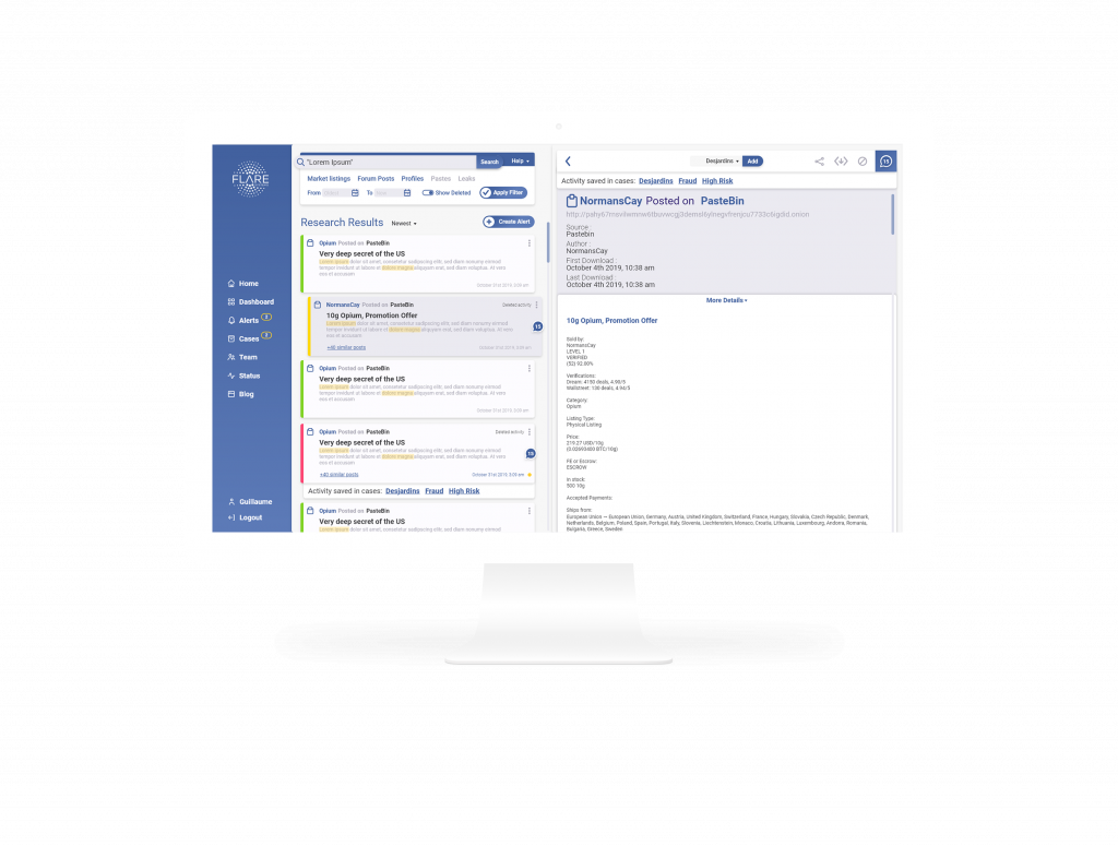
When I joined, the main product of the company was already in use in several of the biggest financial institutions in Canada. the product is a tool for these institutions to identify threats and digital assets that are made publicly available on the web and the darkweb due to human error or malicious actors in order to protect their data, financial resources, and reputation.
As it was in use, the product was already renowned in the cybersecurity sector as a powerful tool. Its biggest flaw clearly was its design, as the rapid development of the application made it really complete but also really complex. There was a real need for a user-centered redesign.
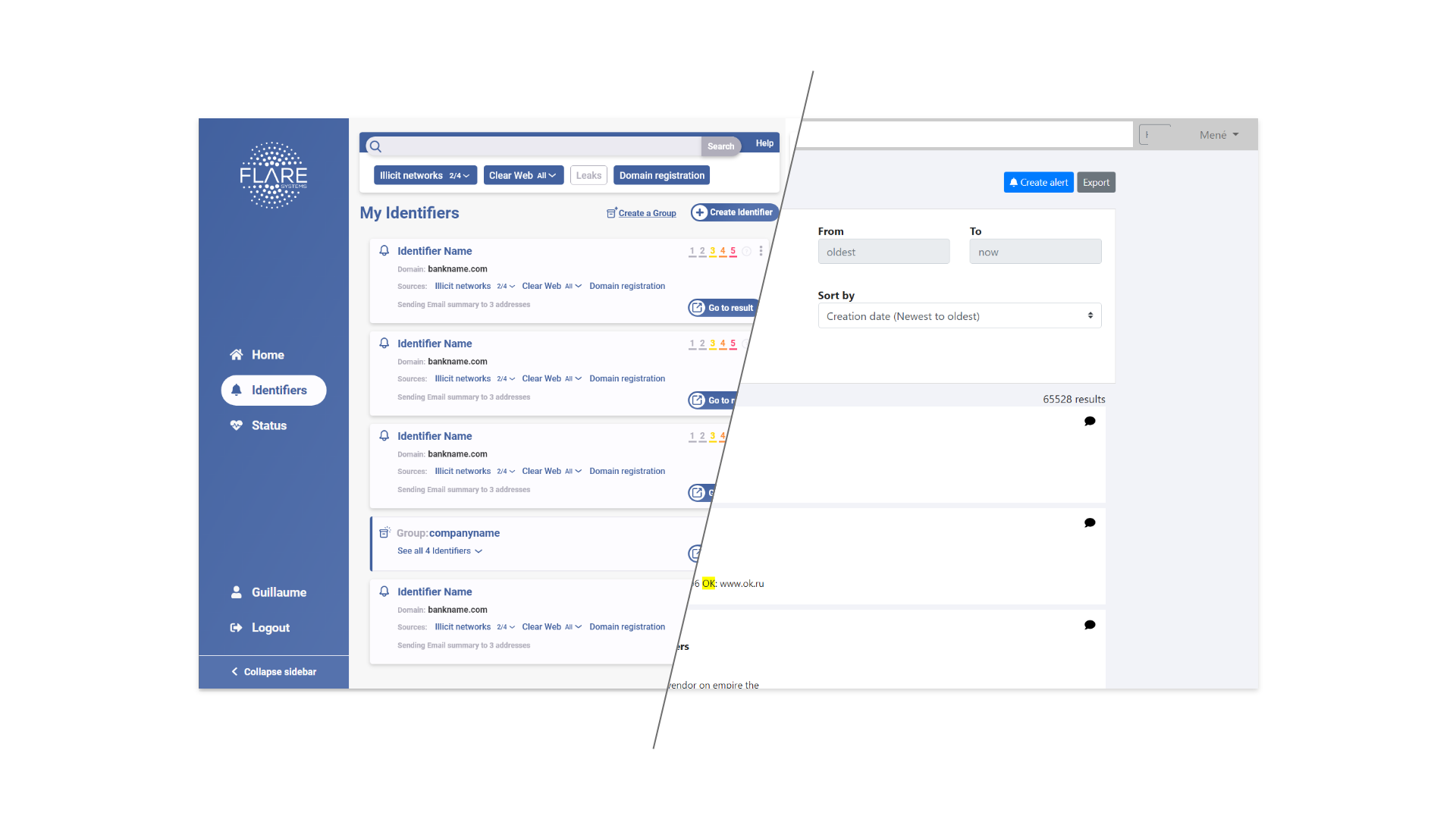
At the beginning of September 2019, I became part of the team, as an intern with great responsibilities. I proved myself and they trusted me to be the “referent designer” in the company. I worked alongside the development team, redesigning already existing functionalities and as a rapid prototyper for incoming new features.
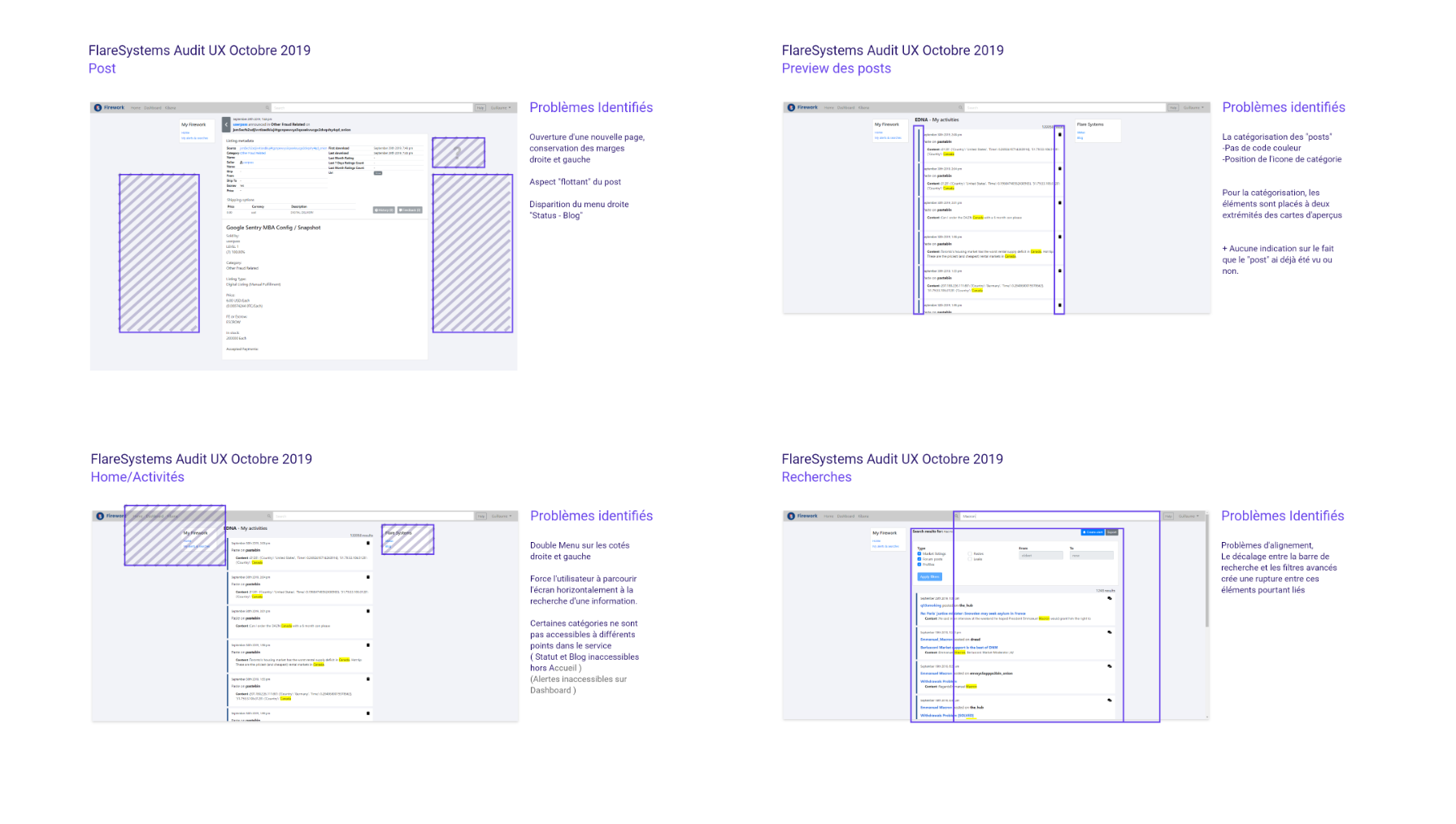
The solution was already on the market, with users in many institutions, the team already possessed a feedback database which was a wonderful asset in order to detect what were the user’s frustrations. Plus, Mathieu, one of the co-founders was a power user of the platform and also created his own list of issues. These tools, allowed me to quickly carry out an audit of the product. This highlighted the main flaws in the different user flows, the UX problematics caused by some elements in the global architecture and obviously some other problems in the UI (alignment, spacing, hierarchy … )
More than just a trial of the platform, I used this audit as a way to raise the awareness of the team on User-centered design, and to pass on some UX principles useful for developers.
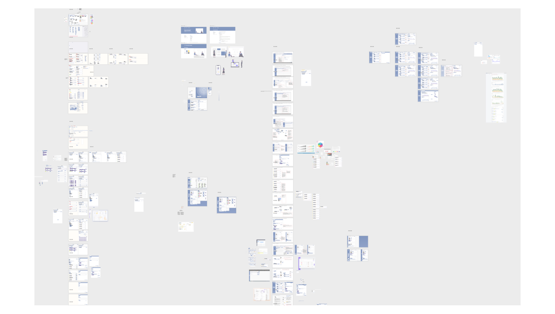
Redesigning the already existing platform was pretty classic, performing multiple iterations during wireframing, we arrived to an efficient global architecture for the platform. Going from a page by page interface (the user needed to open many new tabs) to a screen divided in two sections, allows users to have a quick view on the activity without having to open a new page. Some of the biggest changes were done at this moment, the product already was totally different.
Then, still applying the agile method used by the start-up we developed more in depth UX principles. Such as the new advanced search bar, the color as an indicator for risk level, the comment options ... We also focused on hierarchy of information, as the platform is mainly displaying text content and potential high-risk activities that need to be acknowledged by the users.
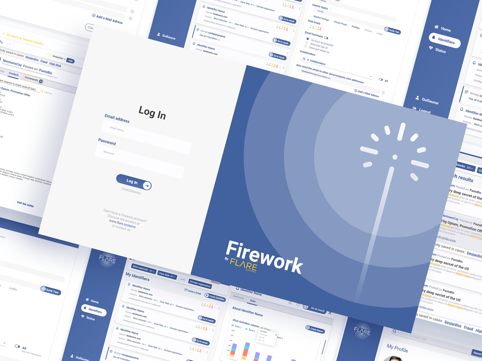
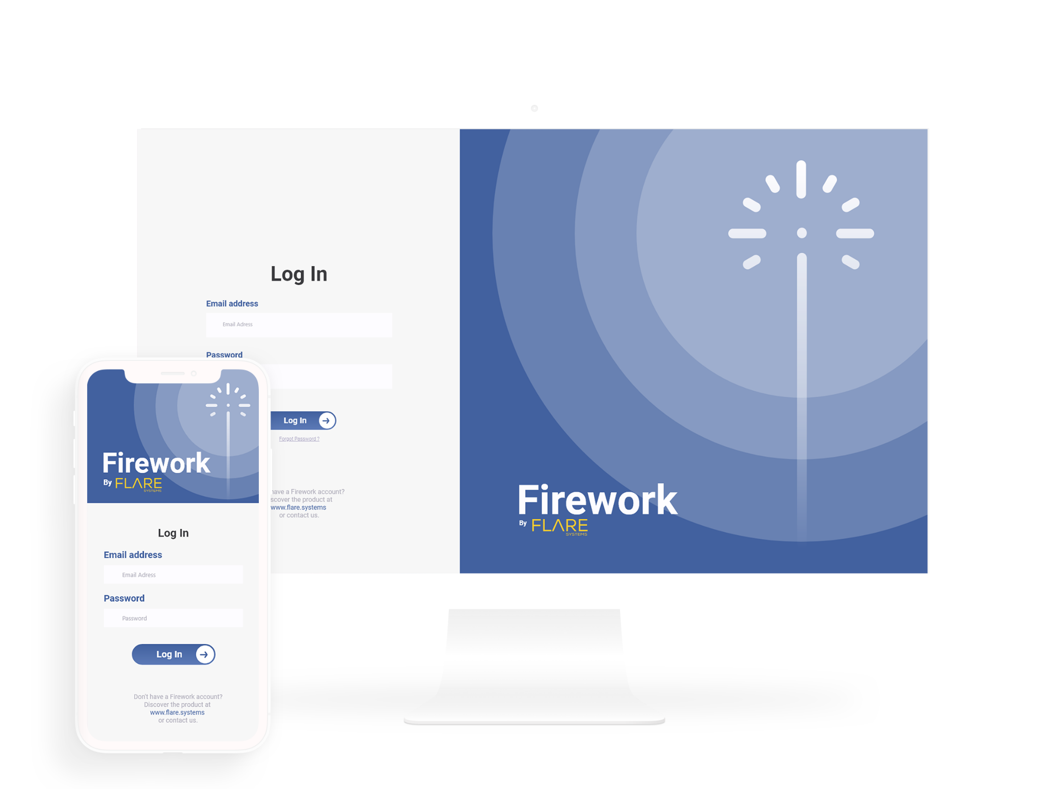
We then created the new identity for the product, in line with the company identity that just was rebranded. This unified all the different sections of the solution, making it a real complete and professional tool.
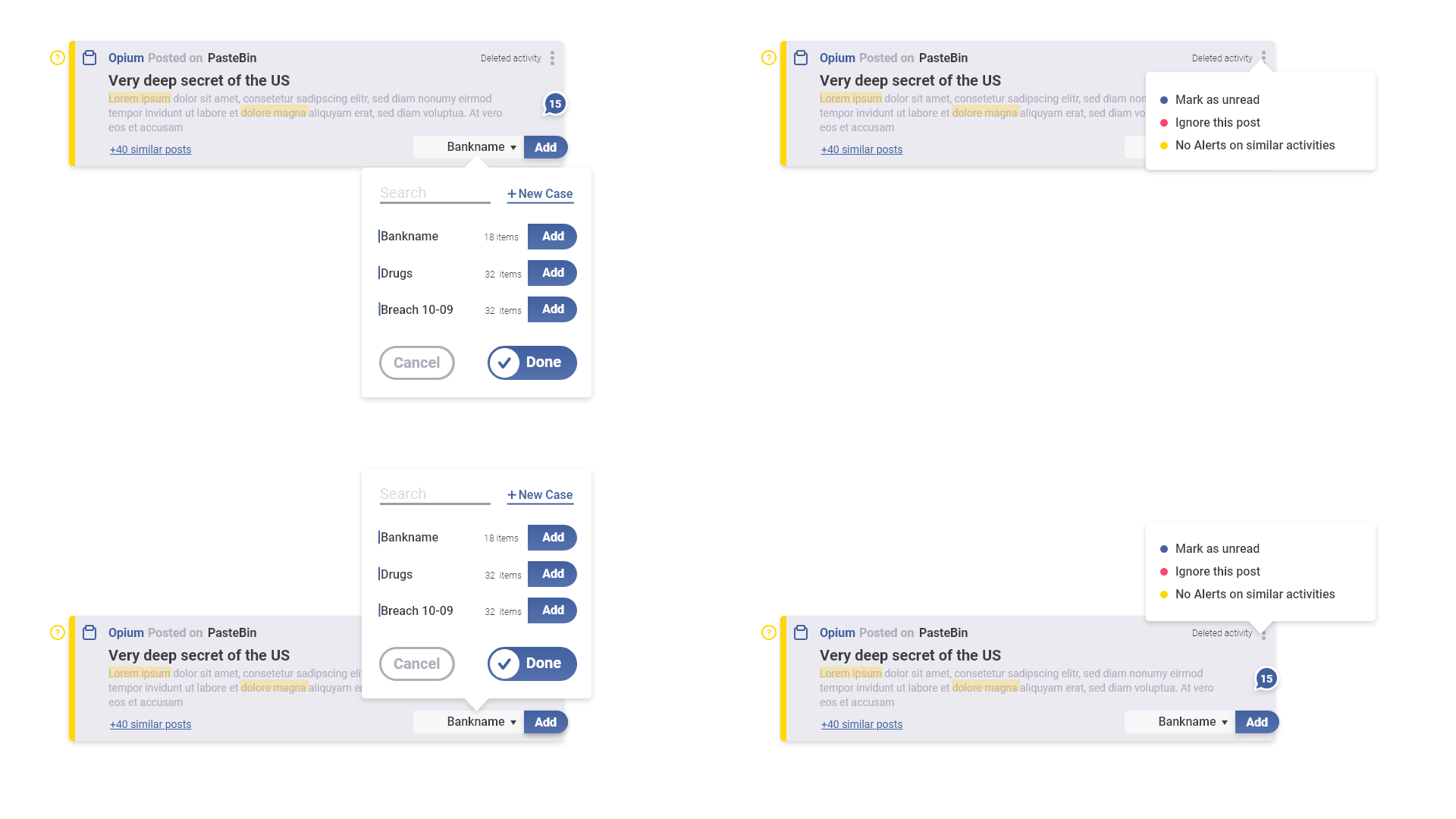
While rebuilding the product in a user-friendly interface, we kept in mind to make it easy adding new features by segmenting it in a way that, any new element would not impact the already existing tools.
Creating and adding new features is, for me, the more creative part of my work at company. The co-funders and developers just gave me kickoff meetings on potential new functionalities, then my role was to iteratively create rapid prototypes for each of these, so the team had tools to quickly develop the new features. This was really gratifying as interactions I designed were sometime developed and integrated less than a week after.
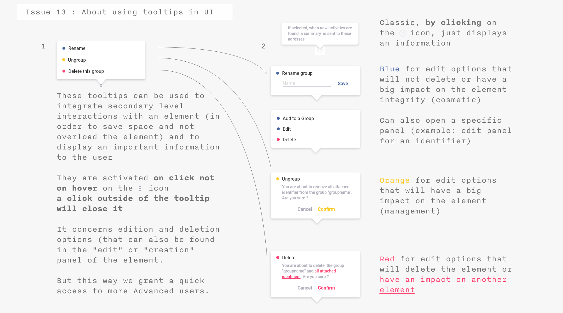
Most of the design were created using Adobe XD, using the different collaboration tools, allowing me to share and update my prototypes to the development team. These tools are really powerful and were comfortable as long as we were working on already existing features redesign and all in the same space. But these tools showed some flaws when we started developing new elements, the different documents were to complex, and it was easy to be lost when focusing on some precise interactions.
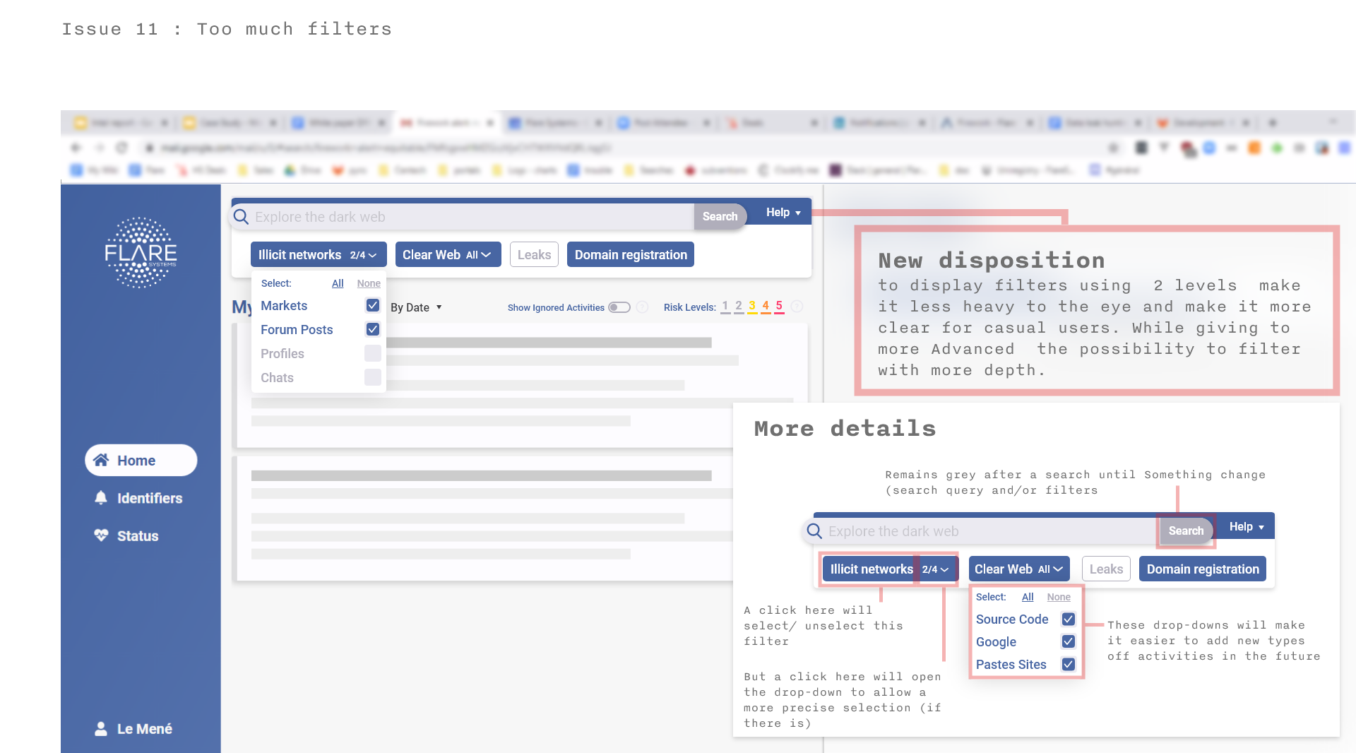
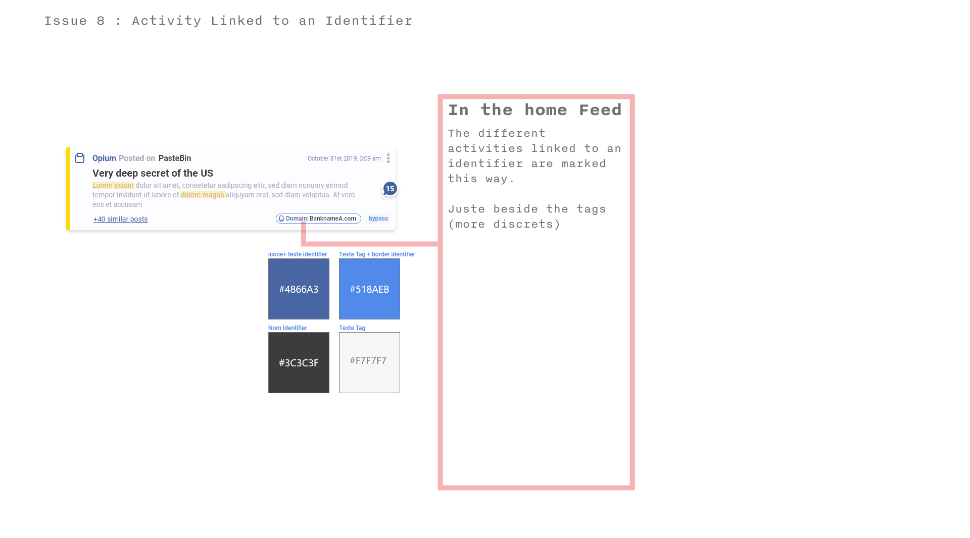
When due to Covid-19 we faced the confinement, and we worked remotely, it became a real communication issue, as the developers were not able to quickly interact with me to get the informations they needed. Together we agreed on a new system of what we call “cards” were I would just produce images, focusing on a precise element, so the developers would have all the information needed in a single view. This system also gave me the opportunity to create some cards that are “mini-tutorials” focusing on the use of specifics elements in the product. Sharing the prototypes through this simple system instead of using complex tools was for us the best solution.
My experience at this cyber-security company is truly what made me change from a student to a confident designer. I was a real member of the team and had great responsibilities. It made me more mature, refining my workflow and the way I communicate my design to others. Moreover, the team is composed of passionate and open-minded people from whom I’ve learned a lot and the product I had the chance to work on is highly complex and engaging through real societal stakes.
 back to projects